Let’s get to know each other
Accelerate your business potential with our dedicated team.

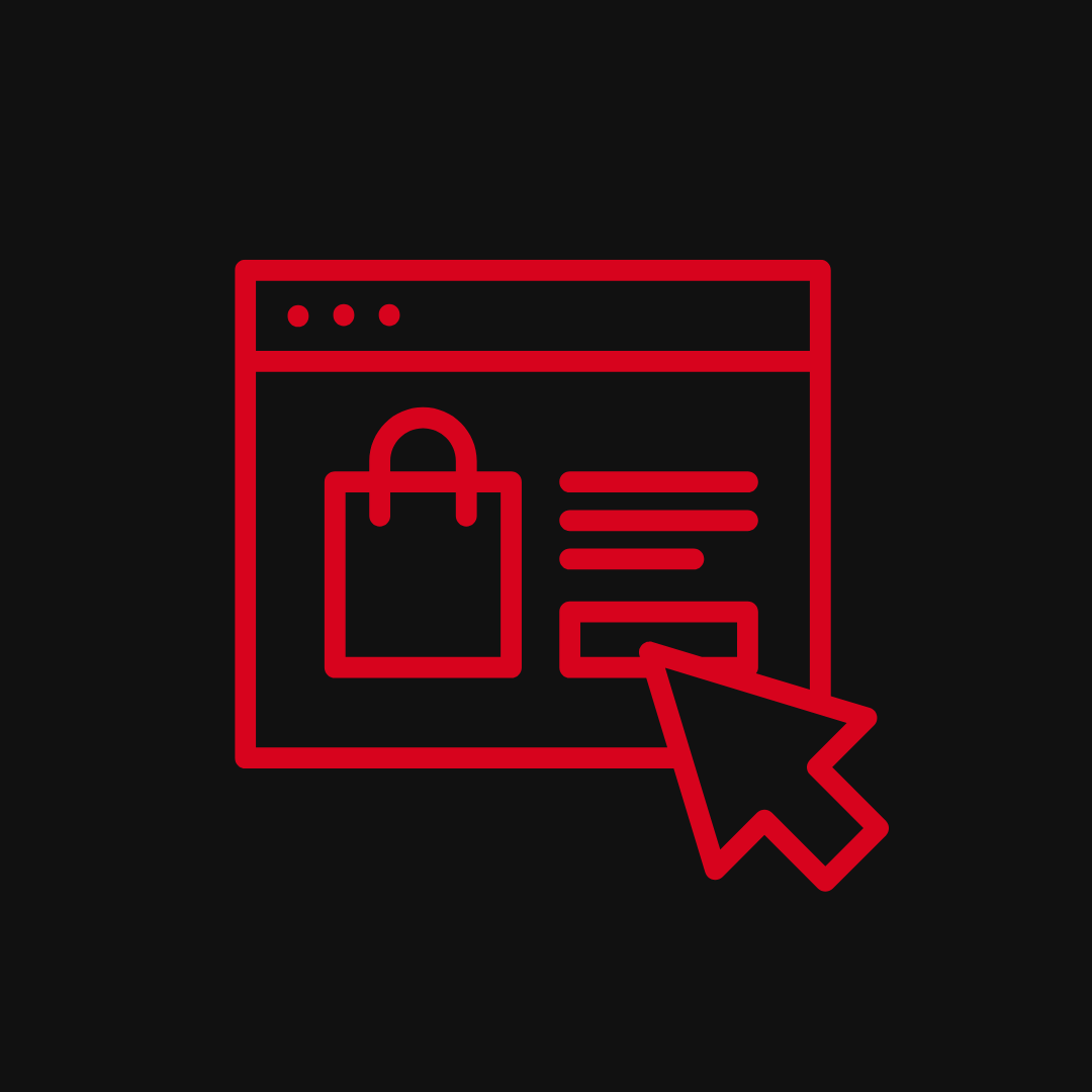
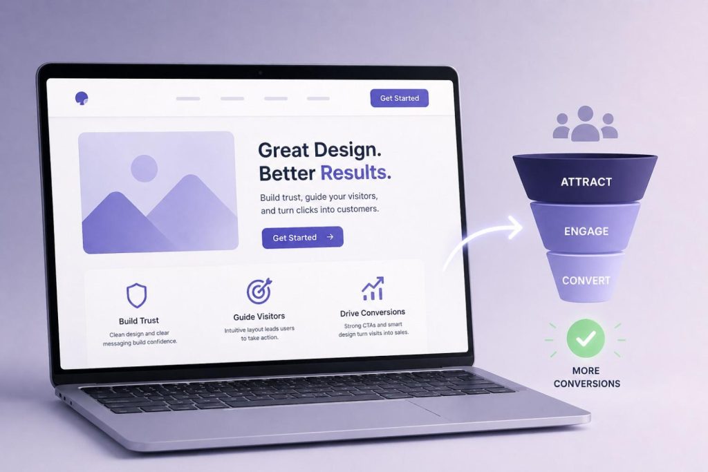
Designing for Trust
Why Beautiful Websites Fail to Convert
May 14, 2026 5 MINUTES 56 SECONDS
DESIGNING
Content
A beautiful website that doesn’t convert isn’t a design success — it’s an expensive distraction. The reason most high-aesthetic websites underperform on conversion is simple: they were designed to impress, not to reassure. And reassurance is what actually moves people to act.
Website trust signals are what separate a website that looks good from one that performs. Visitors don’t consciously audit your site for credibility — but they feel it immediately. Something feels off, and they leave. Something feels solid, and they stay. That feeling is design doing its job — or failing to.
Most teams invest in aesthetics and assume conversion will follow. It doesn’t. Trust has to be designed deliberately — and it looks nothing like a mood board.
Key Takeaways- Beautiful design earns attention — trust signals earn conversions. You need both, in the right order.
- A low website conversion rate is almost always a trust problem before it’s a traffic problem.
- UX vs UI design matters here: UI makes the site look right, UX makes it feel safe to act on.
- Social proof on a website isn’t decoration — it’s the single fastest way to transfer credibility.
- Most website design mistakes that break trust are invisible to the team but obvious to the visitor.
- Conversion rate optimization without trust signal auditing is guesswork dressed up as strategy.
What Does “Designing for Trust” Actually Mean?
Designing for trust means making every design decision through the lens of one question: does this make the visitor feel safe enough to take the next step? It’s not about looking credible — it’s about feeling credible, at every point in the journey.
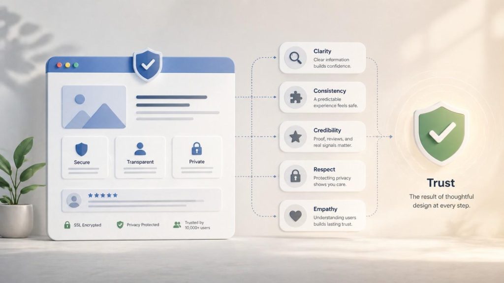
Website trust signals are the specific design and content elements that communicate reliability, legitimacy, and competence — without the visitor having to consciously look for them. They include:
- Website credibility factors like clear contact information, visible security badges, named team members, and professional visual consistency
- Trust signals on a website like real testimonials with full names and photos, recognisable client logos, third-party review platform badges, and case studies with specific results
- Transparency signals — return policies, pricing clarity, privacy statements that are easy to find
Designing for trust is not the same as designing for beauty. A stunning website can fail all of the above. A plain one can nail them. The goal is a site where the visitor’s instinctive response — formed in the first three seconds — is a legitimate business I can trust, not this looks nice but I’m not sure what’s real here.
Why Do Beautiful Websites Fail to Convert?
Beautiful websites fail to convert because aesthetics and trust are different problems — and most design briefs only solve one of them.
Website conversion is driven by clarity, credibility, and friction reduction. A site that prioritises visual sophistication over those three things will consistently produce a low website conversion rate, regardless of how much traffic it attracts or how much the team loves the design.
The specific reasons beautiful sites underperform:
- Clarity gets sacrificed for style – Abstract hero sections, vague taglines, and motion-heavy layouts look impressive but leave visitors uncertain about what the product actually does or who it’s for.
- Social proof gets buried or deprioritised – Design-led teams often treat testimonials as a necessary evil — something to accommodate, not something to feature. That’s a website conversion strategy failure.
- The visual hierarchy doesn’t match the buyer’s journey – What looks balanced in a design tool often directs the eye away from the actions that matter — the CTA, the pricing, the trust markers.
- Conversion focused design – Gets treated as the opposite of beautiful design. It isn’t. But when the two are in tension and aesthetics wins, conversion loses.
Conversion rate optimisation starts with asking whether the site is built for the person looking at it — or for the team that built it.
The Gap Between Aesthetics and Conversion
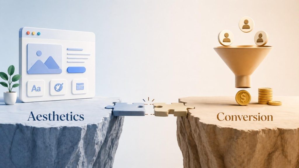
The gap between aesthetics vs usability is where most conversion problems live. A site can be visually flawless and behaviourally broken at the same time.
UX vs UI design is the clearest way to frame it:
- UI (User Interface) is what the site looks like — colours, typography, layout, visual hierarchy.
- UX (User Experience) is how the site works — how easily someone can find what they need, understand what to do next, and feel confident doing it.
Most sites with conversion problems have strong UI and weak UX. They look considered but feel confused. The visitor can’t find the pricing. The CTA appears before they’ve been given a reason to click it. The navigation buries the most important page three levels deep.
Conversion focused design bridges this gap by treating user behaviour — not aesthetic preference — as the primary brief.
Common Design Mistakes That Break Trust
Most website design mistakes that damage trust aren’t obvious from inside the organisation. The team sees the brand. The visitor sees the gaps.
The most common ones:
- No human presence – A site with no faces, no names, and no story feels like a front. Stock photography makes it worse, not better.
- Vague or missing social proof – Testimonials without names, photos, or specific results don’t build trust — they raise questions.
- Inconsistent design quality – A polished homepage followed by a poorly formatted blog or a broken mobile layout signals that no one’s paying attention. That carelessness transfers to how visitors perceive the product.
- UI mistakes that signal inexperience – Misaligned elements, inconsistent spacing, wrong font weights, slow load times — none of these are fatal alone, but together they erode the sense that this is a serious operation.
- Hiding the hard information – Burying pricing, making the refund policy impossible to find, or using vague language around what’s actually included — visitors notice this. It reads as evasion.
- Too much going on – Animations, popups, chat widgets, banners, and autoplay video all fighting for attention at once signal chaos, not confidence.
Trust is lost in the details. And the details most teams overlook are exactly the ones visitors use to make their decision.
What Builds Trust on a Website?
Trust on a website is built through specificity, consistency, and social validation. Vague claims and polished visuals don’t do it. Specific evidence does.
A social proof website done well doesn’t just have a testimonials section — it integrates proof throughout the entire journey:
- Real website trust signals placed at the moment of doubt: near the pricing, above the CTA, beside the sign-up form
- Website credibility factors like named authors, dated content, verified reviews, and linked case studies
- Logos of recognisable clients or partners — not as decoration, but as a shorthand trust transfer
Beyond social proof, what builds trust:
- Speed and performance – A slow site signals neglect. Visitors equate load time with reliability.
- Mobile experience – If the mobile version feels like an afterthought, so does the business.
- Clear, jargon-free copy – Confident businesses explain themselves plainly. Uncertain ones hide behind complexity.
- Visible contact options – A real address, a phone number, a named support email — these are trust signals on a website that most visitors never use but everyone needs to see.
- Consistent visual identity – Every page feeling like it belongs to the same brand signals that the business is organised, intentional, and trustworthy.
How to Design Websites That Convert
Conversion rate optimisation is not a set of tweaks applied after the site is built. It’s a design philosophy applied throughout. The highest-converting sites aren’t the most beautiful — they’re the most trusted.
CRO best practices that actually move the needle:
- Lead with clarity, not cleverness – The hero section should answer: what is this, who is it for, and why should I care — in under five seconds.
- Design for the moment of doubt – Every point at which a visitor might hesitate — before a form, beside a price, after a claim — is where trust signals belong.
- Use real social proof at the point of decision – A testimonial at the top of the page is decoration. A testimonial directly beside the CTA is conversion architecture.
- Reduce friction relentlessly – Every extra field, extra step, extra click is a reason to leave. UX for conversions means removing every obstacle that isn’t absolutely necessary.
- Test with real users, not assumptions – What the team thinks is clear is often not what the visitor experiences. Session recordings, heatmaps, and user testing reveal the real gaps.
Conversion focused design looks like a site where the visitor always knows where they are, what they’re being offered, and why they should trust the business making the offer. That’s the brief. Everything else is in service of it.

Conclusion
The most converting website isn’t the most beautiful one — it’s the most trusted one.
Aesthetics earn the first impression. Trust earns the conversion. The brands that understand this don’t treat design and credibility as separate concerns — they build them together, intentionally, from the first wireframe to the final live page.
If your traffic is strong and your conversion rate isn’t, the site probably looks better than it feels. Start there.
And if you’re trying to bridge that gap, it’s rarely about adding more — it’s about aligning what your brand promises with how it actually shows up. That’s where the right strategic approach can make all the difference — which is exactly what we focus on at SimplePlan.
Frequently Asked Questions
-
How to create trust signals on a website?
Start with the basics: real testimonials with names and photos, visible contact information, security badges near forms, recognisable client logos, and clear pricing. Then place these signals at the moments of highest doubt — near CTAs, beside pricing, above forms — not just on a dedicated testimonials page.
- Why is conversion rate optimisation important?
- Is design not important for conversions?
- How does lack of trust affect conversions?
Let’s get to know each other
Accelerate your business potential with our dedicated team.