Soko
Soko, a female-founded intimate wear brand, is dedicated to providing South Asian women with a comfortable shopping experience for intimate wear, wholeheartedly championing the embrace of imperfections and supporting you just as you are.
BRANDING & IDENTITY
WEBSITES & APPS

A remarkable brand that transforms the everyday bra experience, prioritizing comfort in their apparel while infusing warmth and approachability into the shopping experience.
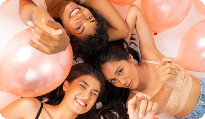
The brand emerges as an authentic and bold voice in the Malaysian market saturated by over-sexualized images of women’s intimate apparel. Soko recognizes that the function of a bra goes way beyond its mere appearance and therefore actively addresses its customers’ comfort needs with its product line. Its marketing portrays women as they are and provides educational resources to help women know their bodies better. Soko thoroughly facilitates easy shopping for the perfect bra.
It is through wearsoko.com that Soko puts forth its comfort-first narrative and facilitates a hassle-free shopping experience for its products. More than just an intimate apparel brand, it is aimed at creating an approachable space that respects local cultures while offering high-quality, comfort-first bras to women in Southeast Asia. Soko is all about empowering women, inside and out.
Across a period of 6 months, SimplePlan designed and developed Soko’s brand identity – from brand ideation to website design and integration, meeting all the requirements of a unique brand like itself.
The Challenge
As the first-of-its-kind voice in Southeast Asia, that sees bras as not just a visual accessory but a vital source of support, Soko’s branding brought its own share of challenges. Primarily because the brand was disruptive but not threatening.
First, there was the critical need for cultural sensitivity and therefore, an accurate representation of diverse cultures without any missteps. Additionally, the highly competitive lingerie market demanded that we stand out with our authenticity and emphasize cultural respect and community building, not just product design. Diverse representation in marketing and design was another challenge we embraced, requiring continuous effort to avoid tokenism. Lastly, we aimed to educate consumers about the value of comfort and high-quality, everyday bras, knowing that shifting perceptions may be a gradual yet essential process in our branding journey.
To bring out the brand’s focus on utility and comfort and an aversion to sexualized extravagance, soft and minimal design elements were used to form its brand identity.
How did SimplePlan do it?
The SimplePlan team brought the brand’s vision to life by leveraging expertise, practicing our characteristic dedication, and exhibiting a sincere understanding of the brand. The result was a tangible and visually captivating experience bringing the Soko narrative to life.
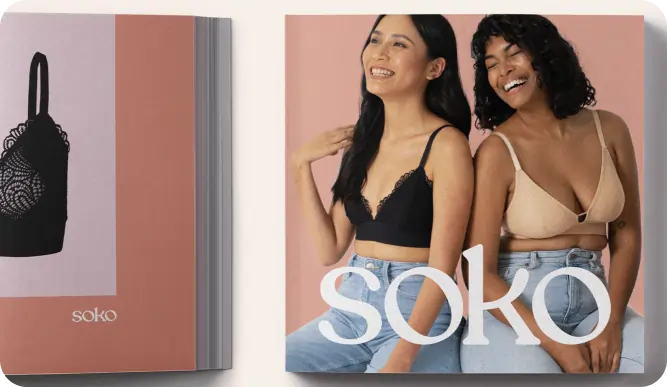
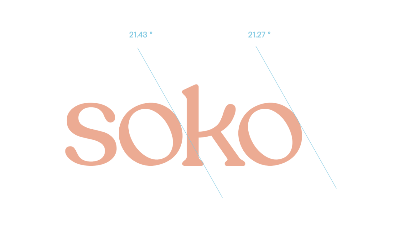
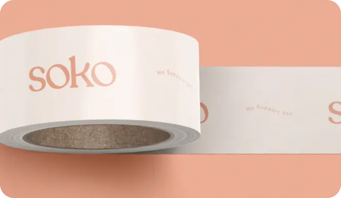
The name “Soko” finds its roots in the Malay word ‘Sokong,’ signifying support, and this essence is cleverly mirrored in the wordmark. By making subtle adjustments to the Recoleta font, one can observe the ‘Os’ appearing to lean on the ‘S’ and ‘K,’ artfully representing the essence of “Soko”.
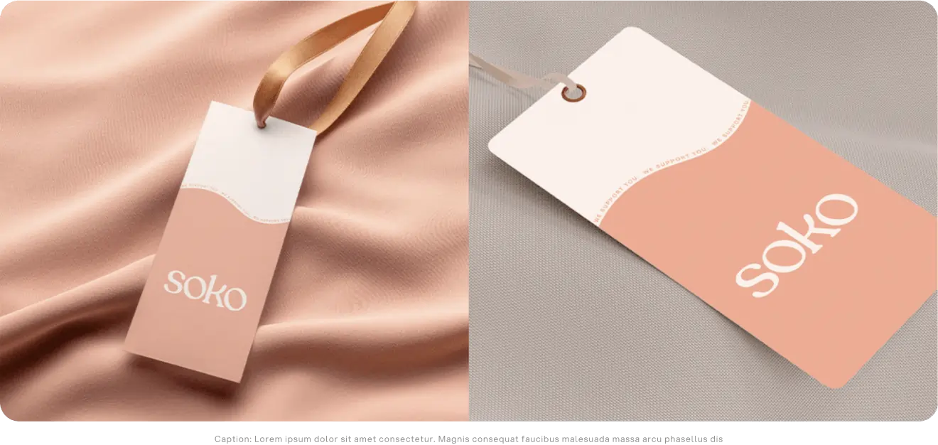
Other design choices, whether significant or subtle, are purposefully employed to ensure that the intended audience truly connects with the narrative and the warmth that the brand aims to convey. The colors chosen for the brand were peach puff, light salmon, corn silk, and light yellow encapsulating all the emotions that the brand radiated – care, strength, optimism, and courage. The brand focuses on embracing imperfections, and supporting its customers as they are. This celebration of imperfections was signified by waves of different sizes and with arbitrary flow. Graphical elements such as hand-drawn underlines and illustrations, arrows, and circles have been used to accentuate the idea of imperfection. The typography, too, conveys softness and warmth using fonts like Recoleta Regular and Basis Grotesque Pro.
To maintain a consistent and relatable character in all our communications we strategized the brand’s tone of voice in alignment with its distinctive personality. Driven by, first of all, empathy for the end-user, we ensured that the communication carried genuine compassion and simplicity, choosing words that were easy to understand. The tone was deliberately crafted to be comforting, ensuring customers that their feelings are acknowledged and that Soko was here to help. While a touch of humor was introduced to add a playful element, it wasn’t solely relied upon to address sensitive situations. The primary focus was always on maintaining a warm and positive attitude throughout the copy. To meet these criteria, active voice and concise sentences were used, and complex concepts were presented in a friendly, approachable manner rather than a didactic one.
Soko reimagines intimate experiences for women making them feel comfortable, supported, and liberated by striking a balance between local culture and modern values.
For a lifestyle lingerie brand that so courageously breaks age-old conventions to provide comprehensive comfort and support to its users, the website had to exude both boldness and warmth not just in terms of design but also development. The website achieves this by employing a marquee around shapes that highlight the diverse women representing the user or around irregular waves that depict imperfection. The animations are also smooth and subtle to aid its overall communication strategy, providing users with a fresh experience and clear information as they explore the brand. SOKO was born to challenge the status quo by reimagining what an intimate wear brand can be, helping create a world where women are comfortable, inside and out. Its branding, too, therefore conveys its boldness and courage encapsulated in a warm and comforting approach.
Client:
Soko
Website:
Sector:
Ecommerce
Fashion
Share:
Deliverables:
- Logo & Visual Identity
- UI/UX Design
- Website Development
- Shopify & Ecommerce Development
- Brand Videos & Photography
- Print & Packaging Design