Dar es Salaam International Academy
DIA, an International Baccalaureate school, is dedicated to educating its students and empowering them with the essential skills for the 21st century.
BRANDING & IDENTITY
WEBSITES & APPS

DIA, an international school located in Tanzania, is committed to delivering high-quality education and cultivating global-minded citizens through a well-rounded curriculum with a strong emphasis on cultural values, unity, and personalized attention.
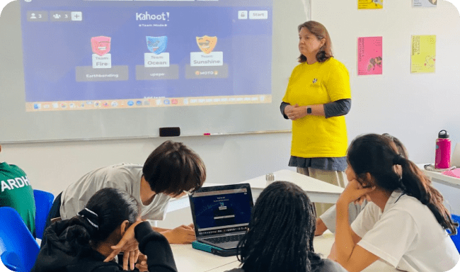
Its holistic approach extends beyond the classroom, encompassing every aspect of a student’s experience at DIA. It’s not just about academics; it’s about character development, empathy, and embracing innovation. DIA’s representation, therefore, must mirror this well-rounded ethos, capturing the depth and breadth of its educational philosophy.
The Challenge
A brand’s identity should reflect its purpose and mission, propelling its vision for society in every aspect of its presentation. SimplePlan had to translate DIA’s commitment to nurturing 21st-century citizens into a captivating brand that resonated with students, parents, and, educators alike.
Furthermore, DIA’s significance transcended that of a mere educational institution; it held a central place in the life stories of students. Therefore, our challenge extended beyond portraying the educational dimension. It necessitated the seamless integration of DIA’s core values of empathy and progressiveness into every aspect of the brand’s identity.
In essence, the challenge was to create a holistic brand identity that vividly encapsulated DIA's role as a beacon of education, values, and innovation in the lives of its students and the community they’ll cultivate.
Bringing DIA to Life
Across a period of 4 months, SimplePlan revamped DIA’s brand identity, creating a vivid picture of what this remarkable institution stands for. The process began with creating a brand strategy that breathed life into DIA’s essence. Revolving around the values of empathy, progressiveness, and approachability – this strategic blueprint made DIA’s vision crystal-clear, setting a strong foundation for the brand’s vibrant reimagining.
From this strategic springboard, our skilled copywriting team leapt into action. Their mission was to define the brand’s personality through captivating words, ensuring a consistent and engaging tone in every brand-audience interaction. The tone of voice decided was conversational, establishing an inviting and reliable presence while also being proactive in its attitude, reflecting DIA’s commitment to pioneering new-age education.
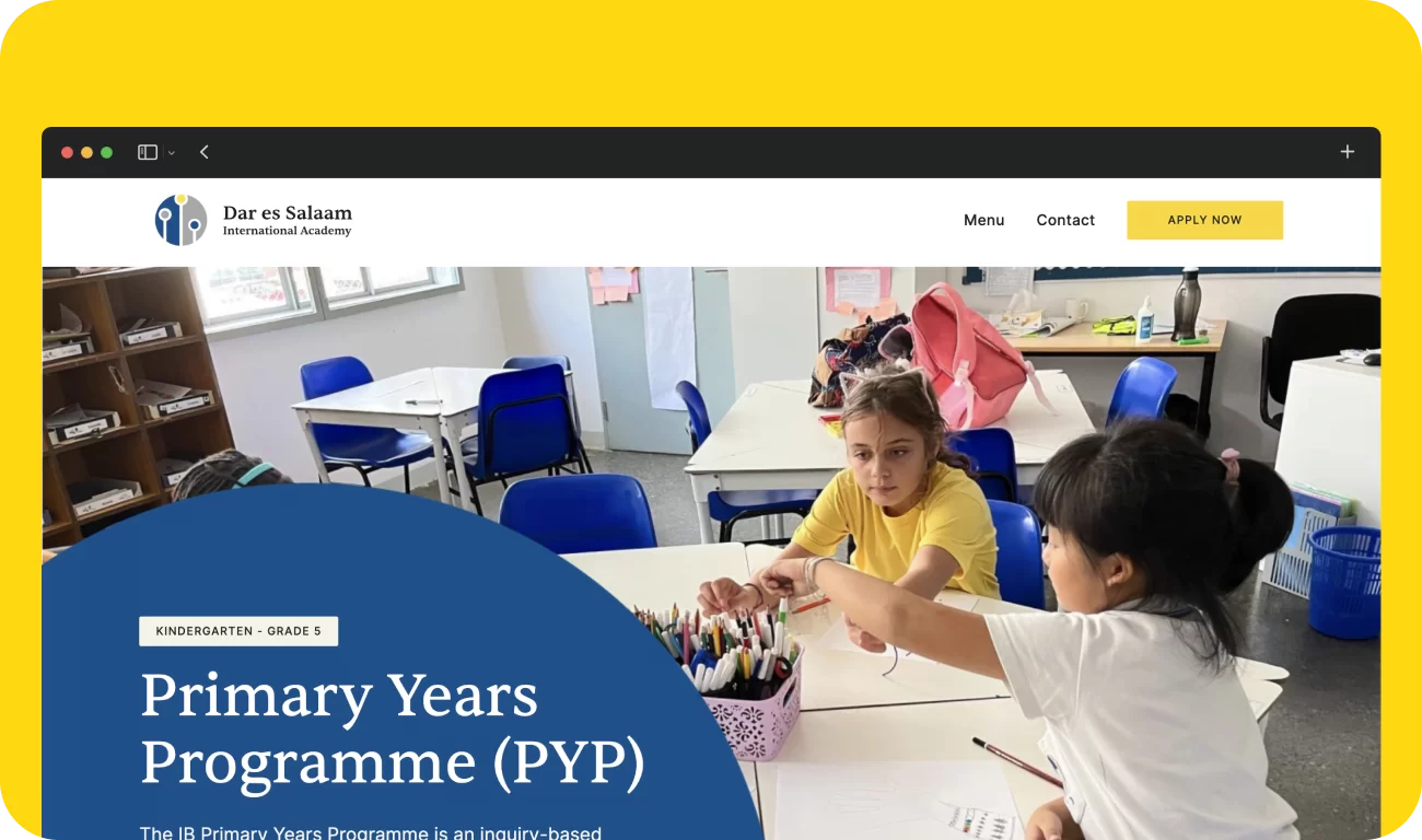
In the digital realm, DIA’s website has been meticulously crafted by our UI/UX team to align with the core characteristics of their school. A recurring circle theme reflects the holistic nature of DIA, representing interconnectedness and a global perspective. Additionally, the font selection caters to the school’s target audience, infusing a creative and playful element through keyword underlining.
The colors of the website were also decided to evoke certain emotions in the user. The rich shade of blue fostered trust, stability and reliability. Combined with yellow, the website elevated from the credibility of blue. The splash of this happy color signified DIA’s commitment to infusing the journey of learning with enthusiasm and joy.
In addition to these thoughtful elements, the website boasts a modern and user-friendly structure. We prioritize accessibility and ease of navigation, ensuring that visitors can effortlessly explore the wealth of information DIA has to offer. The user-centric approach means that finding what you need is intuitive and efficient, making the digital experience as enriching as the education the brand provides.
The synergy of these colors and the modern, minimalistic structure of the website allowed for the portrayal of DIA’s holistic personality.
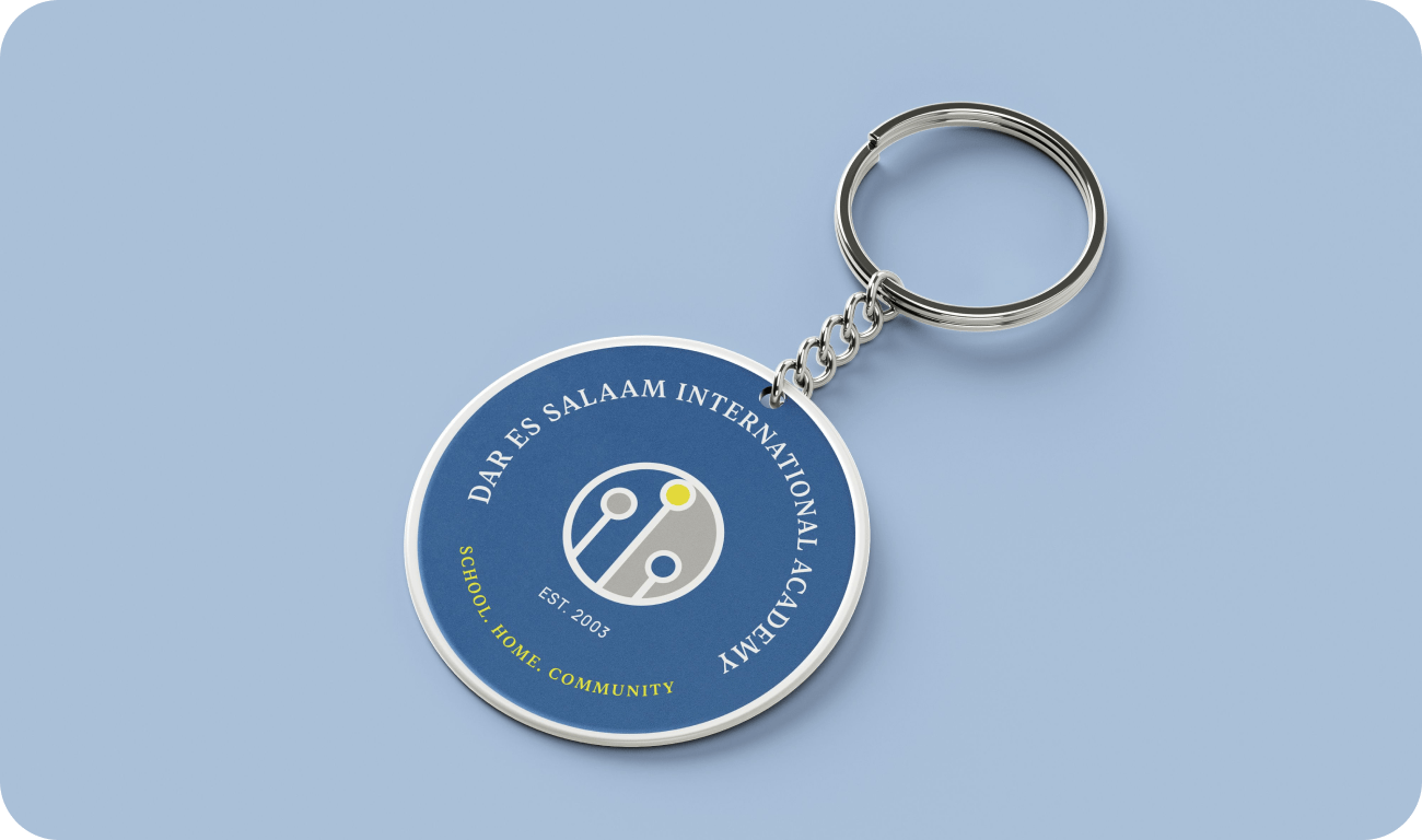
Simultaneously, our design team worked their magic, enhancing DIA’s visual identity and leaving an indelible mark. They also conceptualized a captivating brand mascot that became a recognizable and friendly symbol. Additionally, our designers delved into crafting an array of meticulously designed branded collaterals like business cards and T-shirts. These materials went beyond promotion; they became tangible expressions of DIA’s revitalised identity.
After establishing the brand’s personality and the aligning website, the next step was to introduce DIA in all its glory. For this, SimplePlan created a social media strategy focused primarily on nurturing a thriving online community of students, parents and teachers. This virtual space served not only as a hub for updates but also as a time capsule capturing all the beautiful memories forged inside the walls of DIA.
SimplePlan’s collaboration with DIA resulted in a brand revamp that is highly authentic to the institution’s core values. The new brand identity reflects DIA’s commitment to providing a nurturing and progressive learning environment for all students.
Client:
DIA
Website:
Sector:
Education
Share:
Deliverables:
- Brand Strategy & Positioning
- Brand Messaging & Tone
- Website Development
- UI/UX Design
- Print & Packaging Design