Let’s get to know each other
Accelerate your business potential with our dedicated team.

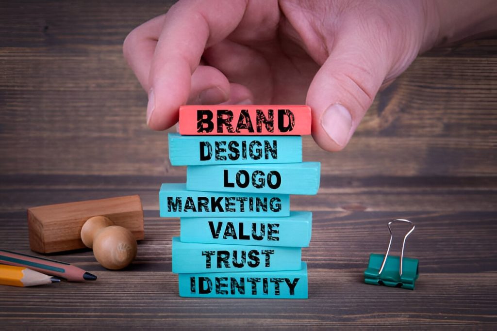
What is Brand Identity?
Importance & Elements
JANUARY 28, 2025 9 MINUTES 28 SECONDS
Branding
Content
We’ve come a long way since the days when a brand was limited to a logo. Although perceived as the face of the company, the logo was limited to business cards, packaging, and office stationery. However, that’s all water under the bridge now, as today’s brands are their logos and a lot more.
Key Takeaways- Brand Identity Beyond the Logo: A brand is more than its logo—it’s a combination of visual, textual, and emotional elements that communicate its mission and values.
- Importance of Consistency: Consistency in brand identity across platforms builds trust, credibility, and recognition among customers.
- Elements That Shape Identity: Key components like logos, color palettes, and typography are instrumental in creating a clear and memorable brand identity.
- Evolving with Time: A brand identity must evolve to stay relevant, reflecting changes in customer needs and societal trends.
What is Brand Identity?

Now, brands are much more than what you see. Hence, creating a brand identity becomes crucial.
“A brand is a person’s gut feeling about a product, service or organization.”
With brands becoming more human-centric day by day, they show emotions, evoke feelings, have a personality, and portray an identity. So what in tarnation is brand identity?
Brands have now ceased to simply be a graphic mark stamp on your office paraphernalia that people become oblivious to – they have now amassed tribes of followers that are dedicated to them and identify with them. If you want to come across as a successful urban professional woman, you find yourself buying into the classic image of a Starbucks-drinking, Louboutin-wearing, chic woman. As a person’s identity is defined by the way they dress, behave, and interact, brand identity is defined by the way it is designed, communicates, and services.
Defining Brand Identity
The outward expression of a brand, including its trademark, name, communications, and visual appearance.
Why is Brand Identity oh-so Important?
Let’s understand why is brand identity important. How do you think your customers identify you in a sea of brands? You guessed it – it’s through your brand identity. Your brand identity includes your logo, typography, jingles, and everything else visual, textual or auditory that goes into communicating your message to your customers. Borrowing from the esteemed Mr Neumeire again, your brand identity is a ‘means of expression’ to influence your brand’s image in the customers’ minds. With several elements, building a strong brand identity is a multi-disciplinary effort where each element complements another to support your goal and message.
If your message and identity are not in harmony, you fail to strike the right chord. And who likes listening to incoherent talkers and bad music? You guessed it again – no one. Especially not your customers. Brand identity thus becomes crucial to brand experience because of the following reasons –
- Your Brand Identity Becomes the Face of your Business: As brand identity is more than your logo, it communicates your brand through other visible elements so that your customers can put a face to your brand. Once your brand becomes the face of your business, your customers will be willing to invest in it.
- Builds Credibility and Trust: When your brand identity effectively communicates your brand message, it builds credibility and trust among your customers. As they become familiar with your values and message, they think of your brand as reliable and actively seek out what it offers.
- Communicating the Brand Mission: Your brand identity consists of various brand elements that convey your message through various visual and textual means. These brand elements together give bite-sized chunks to your customer that together make the main course of your brand’s vision and mission.

Brand Identity vs Brand Image

Understanding the difference between brand image vs brand identity is key to successful branding. Brand identity is how a business defines itself—its logo, tone, and values. On the flip side, brand image refers to how customers perceive that brand. Think of brand identity as the message you want to send and brand image as the message people actually receive. Aligning these two can boost trust, loyalty, and your brand’s success.
LEARN MORE: BRAND IDENTITY VS. BRAND IMAGE
Brand Identity Elements

Your brand identity sums up the visible element of your brand. These tangible aspects of your brand leave an intangible impression on your customers’ minds to form an image of your brand.
1. An Unforgettable Logo
We’ve already established that a brand is not just a logo, but a logo plays a big role in contributing to a brand identity nonetheless. Brand identity design matters. Just like the chicken-egg dilemma of what came first, branding puzzlers can ask – what came first, brand or logo? Instead of whiling away time trying to solve this unsolvable mystery, we need to keep up with the evolving rules of branding to create a logo that truly complements the brand. As your logo is the tangible part of your brand that will be exposed the most, it needs to be in sync with the other elements. For example, Disney’s logo expresses magic, childhood nostalgia, fun, and all the joys and celebrations that we associate with that wonderfully unforgettable text-symbol combo.
2. Symbolic Color Palette
Colors bring joy to life. So, your brand’s color palette affects how good your customers feel about your brand. Since colors affect mood, emotions, creativity, and interaction, a solid color palette is instrumental in building your brand identity. With different colors having different meanings that relay diverse emotions, you need to ensure that your color palette is pinned down to best reflect your brand’s value. For instance, the unmistakable Coca-Cola red and white palette portrays excitement, energy, power, and passion. Similarly, your brand’s color palette should symbolize the values and emotions you stand for or wish to invoke in your customers.
3. Matching Typography
Just like your handwriting gives away your identity and personality, your typography also gives away your brand. Fonts can be subtly powerful in shaping your brand identity, so choosing the right font for your brand is very important. Your typography needs to align with your logo, purpose, and personality. Once you manage to match your typography with your brand, your customers will be able to recognize it anywhere. For instance, DC comics interestingly uses the serious and sombre Gothic Bold font, making us wonder whether Gotham City got its name from the font itself. And have a look at the font for Goosebumps – doesn’t it automatically feel dark and scary?
All these components of brand identity are instrumental in creating a clear and consistent brand identity that effectively communicates the values your customers can identify. Yet, creating a brand identity is not enough. You can leave a strong impression on your customers’ minds by consistently advertising it across various channels. Ultimately, when you stay true to your brand identity, you can bridge the gap between your customers’ perception and reality. But remember – as time changes, people change. So, brands need to keep evolving their identity, too.
“It’s very important for a brand to have an identity through the years, but it’s very important as well to evolve because time changes so fast.”
SimplePlan Media specializes in providing brand identity design services that effortlessly communicate our brand’s values, mission, and services. Have a look at our case study for our concept and website for Invogue, a shape-wear brand that is challenging the beauty norms of society.
Case Study – Brand Identity of Invogue

Project: Develop a comprehensive brand identity for a shapewear clothing brand, Invogue.
Process: SimplePlan Media took up a project for Invogue, a shapewear clothing brand, on a mission to transform outdated perceptions. By empowering women to feel comfortable, confident, and unapologetically themselves, the brand challenges stale norms, ushering in a new era of body positivity and self-love.
As the design and branding team, we were asked to come up with a comprehensive brand identity that showcases Invogue as supportive by understanding the power of feeling good from the inside out and its commitment to comfort that allows free movement, helping women embrace life’s possibilities.
Undertaking this challenge, our team adopted an interesting approach by designing the brand’s identity around the brand’s core themes of being modern, bold and inclusive.
To ensure that these values are communicated effectively, we represented them with an icon that became the core icon of the identity. Through graphic representation of the icon, we aligned the various elements of brand identity.
The Takeaway
As SimplePlan took on the challenge of building the brand identity of Invogue, we learnt a larger lesson through the whole branding process and a lot of useful ones.
- Unified Visual Language: SimplePlan Media created a coherent brand identity through the core icon that embodies what Invogue actually is. This became the central core for branding elements, assuring a consistent and instantly recognizable presence across packaging, marketing collaterals, and web platforms.
- Flexible Design Systems: The design framework was intended to function across several mediums without losing its clout. Whether on social media, product labels, or advertising, the brand identity maintained its integrity but allowed room for creative expression designed for that channel of communication.
- Consistency in messages and aesthetics: To enhance brand positioning, the team developed an appropriate color palette, typography, and tone of voice that conveyed the modern, bold, and inclusive nature of Invogue. The unity provided customers with a seamless experience, allowing easy recall and trust in the brand.
- Creating emotions through imagery: Apart from aesthetics, the brand identity was designed to inspire empowerment and confidence. From the campaign photography to the use of visual elements, every single visual detail was intentionally crafted to connect with all women, no matter their body type, to promote Invogue’s mission of self-love and body positivity.

Frequently Asked Questions
-
Give examples of strong brand identity.
Strong brand identity examples includes Coca Cola, Nike, Apple, McDonald’s, Airbnb, Dropbox.
- What is a brand identity?
Let’s get to know each other
Accelerate your business potential with our dedicated team.